How to Use Gridlock Holmes
Your complete guide to creating CSS Grid layouts visually
⚡ Quick Start
Gridlock Holmes helps you create CSS Grid layouts visually. Just three simple steps:
- Select a template or start from scratch
- Adjust controls and watch the preview update in real-time
- Copy the code and use it in your project!
Select Your Template
Start with a pre-built layout or create from scratch
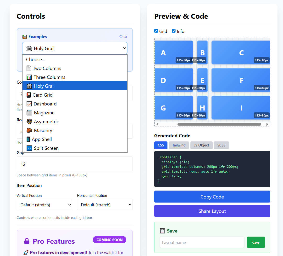
📖 Available Templates:
Two Columns - Sidebar + content
Three Columns - Equal width layout
Holy Grail - Classic web layout
Dashboard - Sidebar + widgets
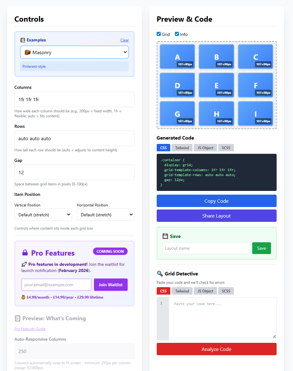
Masonry - Pinterest-style grid
Card Grid - Equal cards layout
Magazine - Featured + sidebar
App Shell - Header/content/footer
Split Screen - 50/50 layout
...and more!
Adjust the Controls
Watch your grid update in real-time as you make changes
📏 Columns
Define how many columns and how wide each should be:
200px= Fixed width column1fr= Flexible column (takes available space)auto= Fits content size
⚠️ Important: Use SPACES between values, not commas!
✅ Correct: 200px 1fr auto
❌ Wrong: 200px, 1fr, auto
📐 Rows
Define how many rows and how tall each should be:
auto= Height adjusts to content (most common)100px= Fixed height1fr= Takes available vertical space
📦 Gap
Control the spacing between grid items (0-100px). The gap appears between items but not around the outside edges.
Watch the Live Preview
See your grid update instantly as you adjust controls
👁️ What You'll See:
- Grid cells labeled A, B, C, etc. to show layout structure
- Cell dimensions displayed (e.g., "107x80px")
- Real-time updates as you change columns, rows, or gap
- Grid lines showing the structure (toggle with "Grid" checkbox)
Copy & Export Your Code
Get production-ready code in multiple formats
📝 Available Code Formats:
CSS
Standard CSS code that works everywhere
.container {
  display: grid;
  grid-template-columns: 200px 1fr 200px;
  gap: 20px;
}
Tailwind CSS
Utility classes for Tailwind projects
<div class="grid grid-cols-[200px_1fr_200px] gap-5">JavaScript
Apply grid styles with JavaScript
container.style.gridTemplateColumns = '200px 1fr 200px';SCSS
Sass/SCSS with variables
$sidebar: 200px;
grid-template-columns: $sidebar 1fr $sidebar;
📋 Copy Code
Click the "Copy Code" button to copy to your clipboard, then paste into your project
🔗 Share Layout
Click "Share Layout" to generate a shareable link to your grid configuration
Bonus: Grid Detective
Catch CSS Grid errors before they cause problems
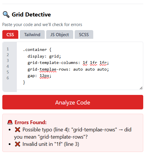
🐛 What Grid Detective Catches:
- Typos in property names (e.g., "grid-templae-rows")
- Invalid units (e.g., "1 fr" instead of "1fr")
- Syntax errors (e.g., using commas instead of spaces)
- Common mistakes with helpful suggestions to fix them
How to use: Scroll to the "Grid Detective" section, paste your CSS code, and click "Analyze Code" to check for errors!
💡 Pro Tips
⌨️ Keyboard Shortcuts
Ctrl/Cmd + S - Save layout
Ctrl/Cmd + K - Copy code
Esc - Close modals
🎯 Best Practices
• Start with a template, then customize
• Use fr units for flexible columns
• Use auto for rows in most cases
🚀 Quick Actions
• Save favorite layouts for reuse
• Toggle Grid/Info view with checkboxes
• Experiment fearlessly - can't break anything!
📱 Mobile Users
• Tap buttons instead of keyboard shortcuts
• Scroll within each section
• Works great on tablets and phones!
❓ Common Questions
What does "1fr" mean?
"fr" stands for "fraction". 1fr means "one fraction of the available space".
If you have 1fr 2fr, the second column will be twice as wide as the first.
Why can't I use commas between values?
CSS Grid uses spaces to separate column/row sizes. Commas are only used for
advanced features (named grid lines). Always use spaces: 200px 1fr auto
How do I make my grid responsive?
Use fr units instead of fixed pixel widths. Or use the "Auto-Responsive Columns"
feature (coming in Pro) for grids that automatically wrap based on screen size.
Can I save my layouts?
Yes! Type a name in the "Layout name" field and click "Save". Your layouts are saved in your browser's local storage. Click "Load" to access them later.
Is Gridlock Holmes really free?
Yes! The core tool is 100% free forever. We're developing Pro features (advanced templates, named grid areas, etc.) which will be optional upgrades, but the main generator will always be free.
Ready to Build?
Start creating CSS Grid layouts visually - no signup required!
🚀 Open Gridlock Holmes GeneratorAdvertisement
📢 Ad Space - How to Use Page
Replace this entire div with your AdSense code after approval
Recommended: Display ad (responsive) or In-article ad